 |
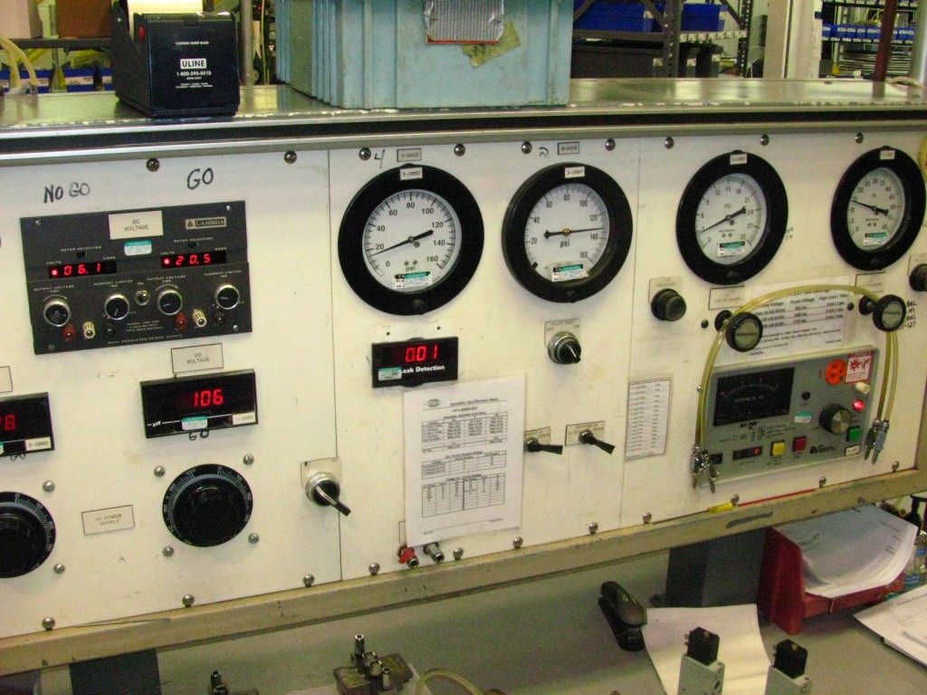 |
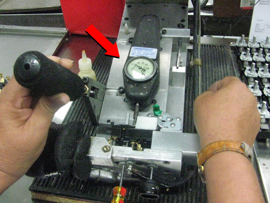
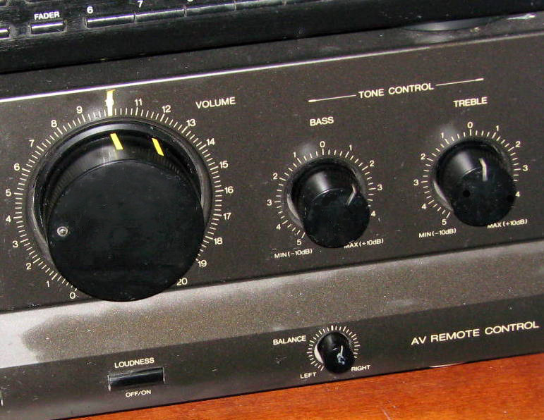
| Dial difficult to read — too small plus glare | Complicated workbench control panel |
Everyone has had the frustration of not knowing how to do something that should be very simple. The inability for almost everyone to program household electronic equipment and change the clock in an automobile. At work, confusing equipment wastes time, leads to mistakes, and steepens the learning curve for jobs. A more serious problem is operating complex control panels, such as in a nuclear power plant or airplane.
In the examples above, the employee had difficulty in reading the display because the numbers were too small and blocked by glare. The workbench control panel so complicated it was eventually replaced by a simplified electronic display.
These issues are the subject of cognitive ergonomics (or cognitive human factors). In essence, the goal of this branch of the field is to design things to be easy to understand and operate. The following is a brief overview of basic design principles for cognitive issues.
1. Standardize
 |
 |
| Standardized | Not standardized |
Operation of single faucets (such as for outdoor garden hoses) are fairly standardized, following the common rule for activation — “righty-tighty, lefty-loosey.”
Double faucets on the other hand are not standardized. Some turn in the same direction, others in opposite directions.
Many errors are caused by inconsistencies in how things work, whether how information is displayed or how controls are activated. To prevent mistakes, a general rule is to insure that similar devices work the same way. Agreeing upon a standard helps prevent errors.
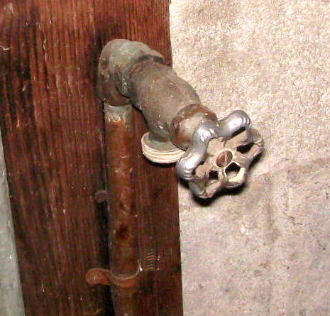
 |
| Gas fittings standardized with reverse thread |
Standards are often deliberately decided by a trade association or industry group. A good example is the reverse thread on gas fittings. These knobs turn the opposite direction of what we normally expect as a safety feature.
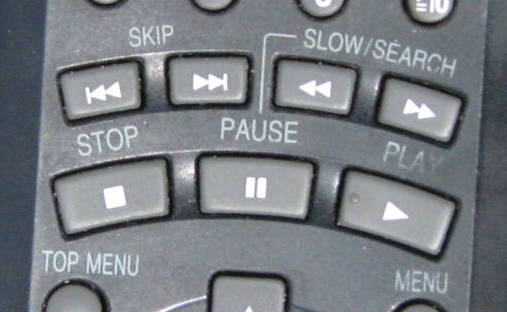 |
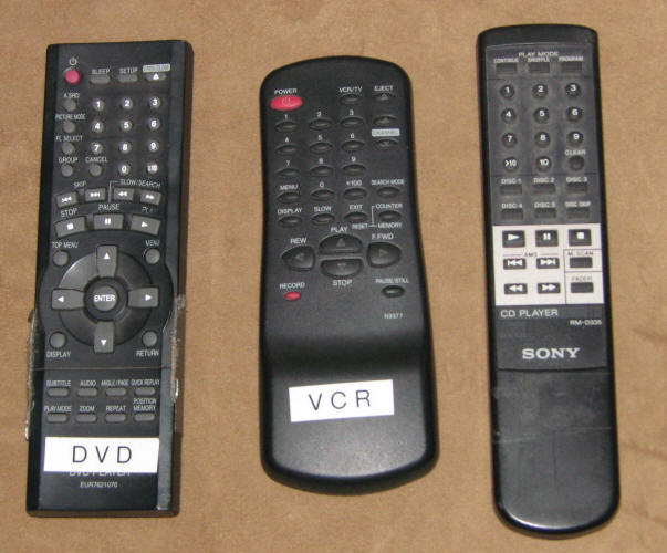 |
| Icons — standarized | Layout of remote — not standardized |
In the workplace, lack of standardization between pipe fittings, pressure valves, and other equipment has caused mistakes with serious repercussions. A standard could be agreeing to wire the controls of several pieces of equipment in the same way, so that an operator can easily switch from one to another. A further example is color-coding wires or pipes. A more formalized standard is a government regulation for labeling hazardous chemicals. Definitions are also standards — agreeing to call things in a uniform way to prevent confusion.
It sometimes does not matter which system is adopted, as long as it is always the same. Other times, an arbitrarily set standard may conflict with users’ perceptions. To prevent the latter problem, the standard should conform to human perceptions.
2. Use stereotypes
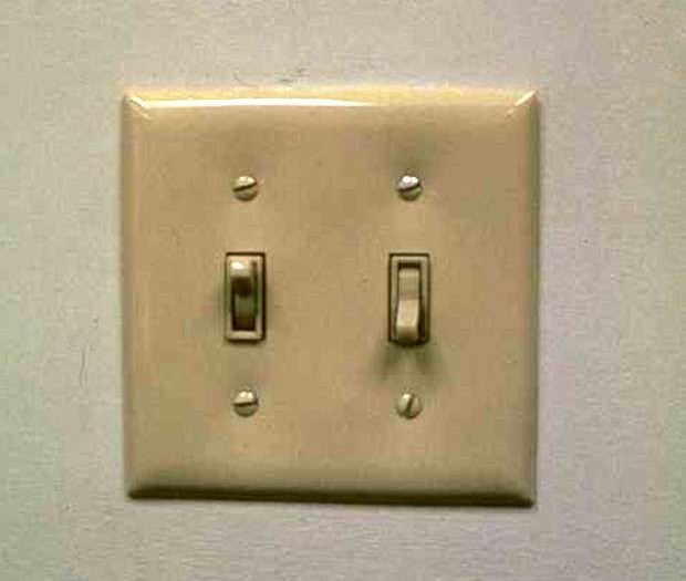 |
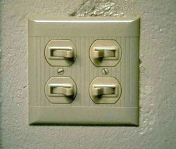 |
| Follows stereotype — Few errors | Violates stereotype — Error prone |
Vertical switches follow a stereotype and cause few errors (assuming one switch per light)
Horizontal switches violate the stereotype, provide no hint of correct operation, and result in confusion and errors
 |
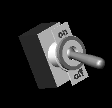 |
| Turning clockwise increases | Flipping up turns on |
A stereotype is a commonly held expectation of what people think is supposed to happen when they recognize a signal or activate a control. Good design should take advantage of these perceptions and expectations.
The concept of a stereotype is closely related to that of a standard, but much less consciously determined. Whereas a standard is a formal agreement to eliminate inconsistencies, a stereotype is an informal convention that has evolved through time. A good standard often follows a stereotype. Conversely, a standard that has become culturally ingrained through widespread use can become a stereotype. Examples of stereotypes are:
Using red to mean stop or danger.
Flipping switches up turns items on.
Turning a dial to the right or pushing a lever forward increases speed or power.
3. Match controls to equipment layout
 |
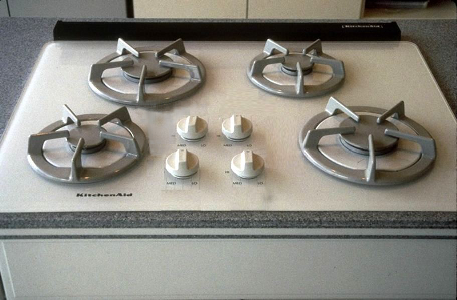 |
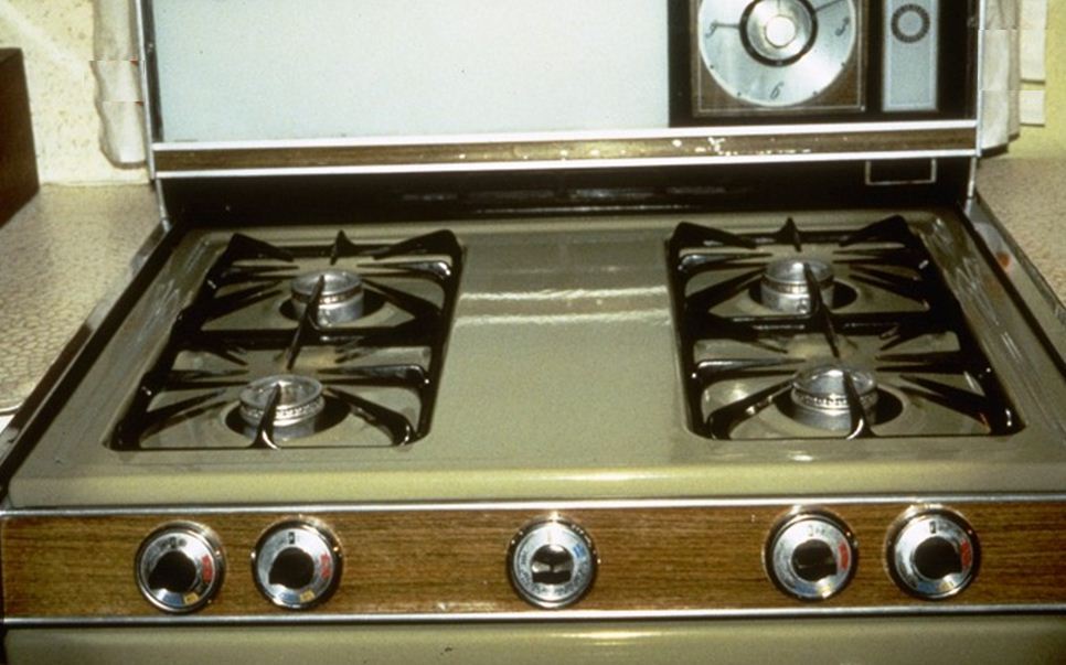
| No hint for which knob controls which burner | Knob layout matches the burner layout |
Probably everyone has turned on the wrong burner on a kitchen range. The reason is that the typical North American kitchen range, the knobs don’t match the layout of the burners (and also, there is no standardization of which knob operates which burner).
In contrast, some newer designs pattern the knobs to match the burners. In this case, it is evident which knob operates which burner.
Ideally, there should be a strong relationship between the perception of the need to take an action and the action itself; that is, a compatibility between a display of information and a control. Good design means configuring items so that it is self-evident what one is supposed to do.
An example is a complex piece of machinery that has a control panel with a multitude of dials. The controls that govern these machine functions should be linked closely with the dials, so that it is intuitive which control affects which function and which dial.
Mnemonics also help in this regard, such as on a car gearshift where the “R” stands for Reverse and the “P” for park. Computer keyboard commands have also exploited this concept. A “control-P” for printing is much easier to remember and more closely linked to the perception of the need to print than is some arbitrary numeral or other letter.
Another good example of this principle is the use of recorded verbal warnings in commercial airplane cockpits. For example, if an airplane goes too low, a recorded voice comes on commanding urgently, “Pull up! Pull up! Pull up!” This system links very quickly the perception of danger with the action of increasing altitude and is far superior to previous systems of warning lights and buzzers, or of relying on the pilots to check the altimeter from time to time.
4. Simplify presentation of information
 |
 |
| Confusing? | Clear? |
Too much information is sometimes provided, or it is provided in too complex a fashion. In general, good designs provide simplified displays (although it can depend on the situation).
 |
|
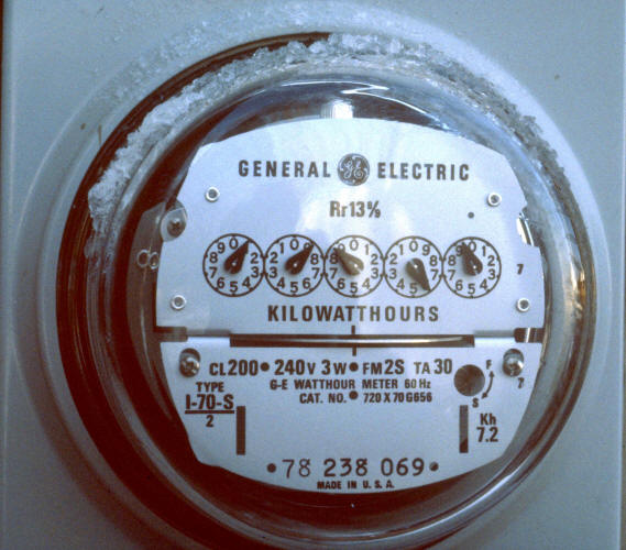
| Gas meter — Highly error prone | Icon — Quick and accurate message |
Gas and water meters with reversing analog dials are complex and error-prone
Icons can present information effectively
The traditional gas or water meter dials (that alternate clockwise and counterclockwise directions for each digit) are examples of complex presentation of information that is nearly impossible to read correctly without careful study and double checking. Even the professionals from the utility companies make mistakes. In contrast, a good example is the use of visual images — photographs, icons, or signs — rather than either written or spoken words.
5. Present information in appropriate detail
 |
|
Digital displays are often best when precise information is required
Analog gauges are faster and clearer for giving general indication
Trend graphs are often best for relative or time-related information
What level of detail of information does the user need to know? There are many options and the choices can enhance or hinder performance. Users sometimes need only general information; signals should be correspondingly approximate and general. At other times, detailed and precise information is crucial.
Another common example is a training session. Sometimes all that the participants in the training session need is an overview, whereas other participants in other sessions desire in-depth materials. Unfortunately, in training sessions this principle is too often violated: Participants are given unneeded information or an unwarranted level of detail.
The design of signs, instruction manuals, and control panels all can benefit from evaluation. What information does the user need to know? It is the job of the writer/designer to do all the hard work of thinking, organizing, and expressing. The reader/ user should have an easy time understanding. Good design leads to ease in use.
6. Present clear images
| Which is easier to read? | Which is easier to read? |
Another common problem is exhibiting an image poorly so that the user cannot distinguish or interpret the message. Three issues in presenting clear images are being visible, distinguishable, and interpretable. Each of these will be described in more detail.
Make it visible — First, the message must be visible. The size and location should be appropriate at the distance from which it is to be observed and there should be no obstructions. Signs and labels should contrast with their background.
Make it distinguishable — The message should also be distinguishable from other surrounding signals and information. Multiple signals, such as with warning lights or alarms, should not be so similar that they can be confused. For example, a fire alarm should have a pattern or pitch that is distinct from othe types of alarms. There should be adequate space to separate messages from one another.
Make it interpretable — Finally, the message should be interpretable. An example of one type of issue is avoiding use of characters that look alike — 1l, B8, QO — and breaking up long strings — (570) 242-4664. Another type of issue is matching the message with the training of the user.
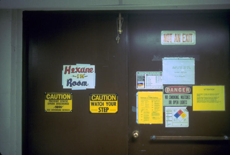
7. Use redundancies
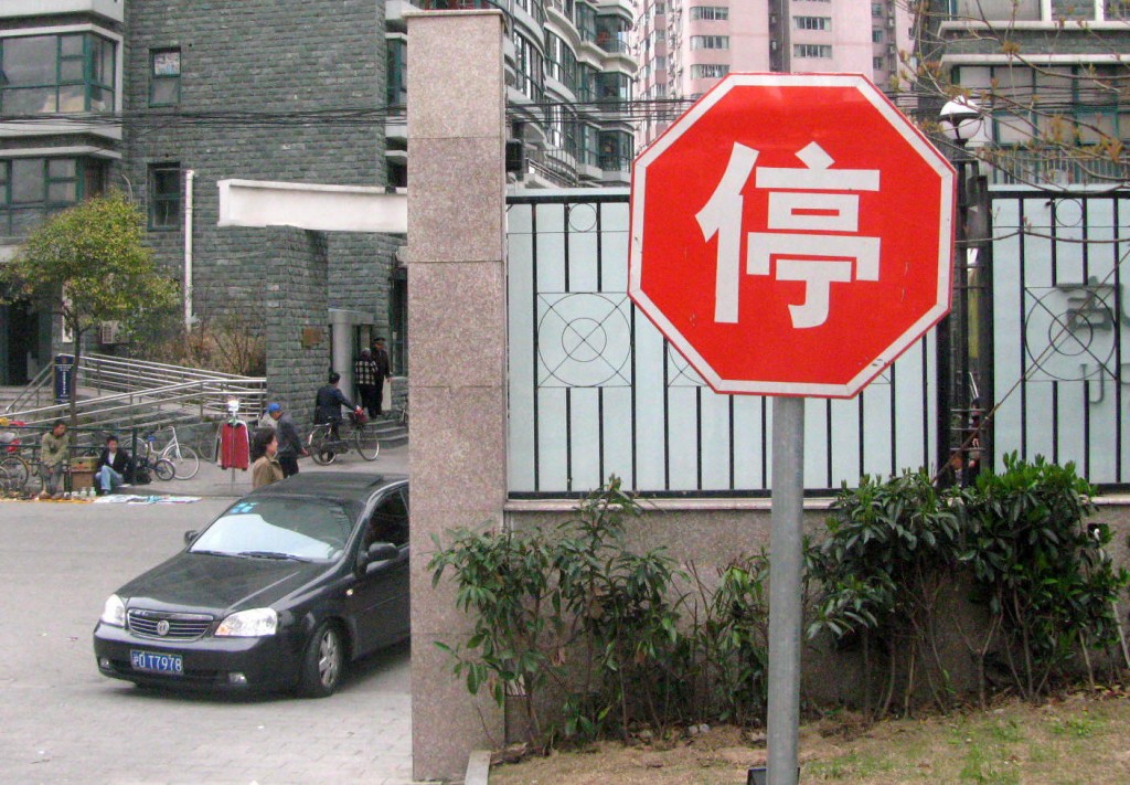 |
| Stop signs have three redundancies |
Sometimes, one message is insufficient. Because mistakes are easy to make and humans have many limitations, it is important to provide the same information in more than one way. In the example above, even if you were driving in China you would understand the sign.
A police car that uses both sirens and flashing lights is a common example. Thus, if you miss one cue, you pick up on another.
The standard system for writing addresses provides an example of a useful redundancy. Technically, with the zip code, the city and state are not needed, since all the information the post office needs is contained in the code. However, it is very easy to make a mistake writing numbers, and the names serve to help the post office correct the error.
The tradition of writing checks with the dollar amounts written out as well as in numeric form helps to overcome bad handwriting and making mistakes. Stop signs at road intersections have three redundancies — color (red), shape (octagonal), and text (STOP).
8. Use patterns
Alignment with zero on top; abnormal operation hard to spot
Alignment to put normal operation on top; abnormal sticks out
The human eye grasps patterns well. Information presented as a pattern can often be understood much more quickly and accurately than otherwise. In control panels for complex equipment, grouping appropriate controls can ease use. Similarly, placing controls in patterns or in a context can help indicate to the user what to do.
When displaying numerical data, graphs are much easier to read and interpret than columns of numbers. Bar charts are especially good for comparing numbers, and line charts are good for showing trends.
9. Provide variable stimuli
Emergency vehicles use flashing lights and sirens that change pitch and patterns.
Humans detect a novel stimulus more readily than a constant one because our senses fatigue easily with continuous exposure. Written warnings are notorious for being ignored, since they quickly become part of the background and simply are not read. Thus, it is important to avoid excessive use of a single way of presenting information.
Emergency vehicles are designed to exploit the principle of variable stimuli. Sirens switch patterns from time to time to evoke attention. Flashing lights are easier to spot than lights that stay the same.
Applications can affect many arenas. Training sessions that switch from one format to another can be more effective than unremitting exposure to a single method of presentation. For example it can be good to intersperse live presentations with videos, group discussions, and written exercizes.
10. Provide instantaneous feedback
Aviators require feedback that communications have been received
An additional principle that helps prevent errors is to provide feedback to the user on the course of action taken. Furthermore, the sooner the feedback is given, the easier it is to determine if an error has been made or not.
Pilots signal that a message has been received with the word Roger (a term itself chosen because these low frequency sounds were more easily understood over a static-ridden intercom in a propeller aircraft than, for example, a simple “yes” with its high frequency sounds).
When taking a telephone message, repeating numbers helps clarify that the correct message is being conveyed. The keys on computer keyboards are deliberately designed to click to help indicate that a character has been successfully transmitted.
The total absence of feedback prevents even knowing if a mistake has been made or not, and it greatly increases the likelihood that an error will be repeated.